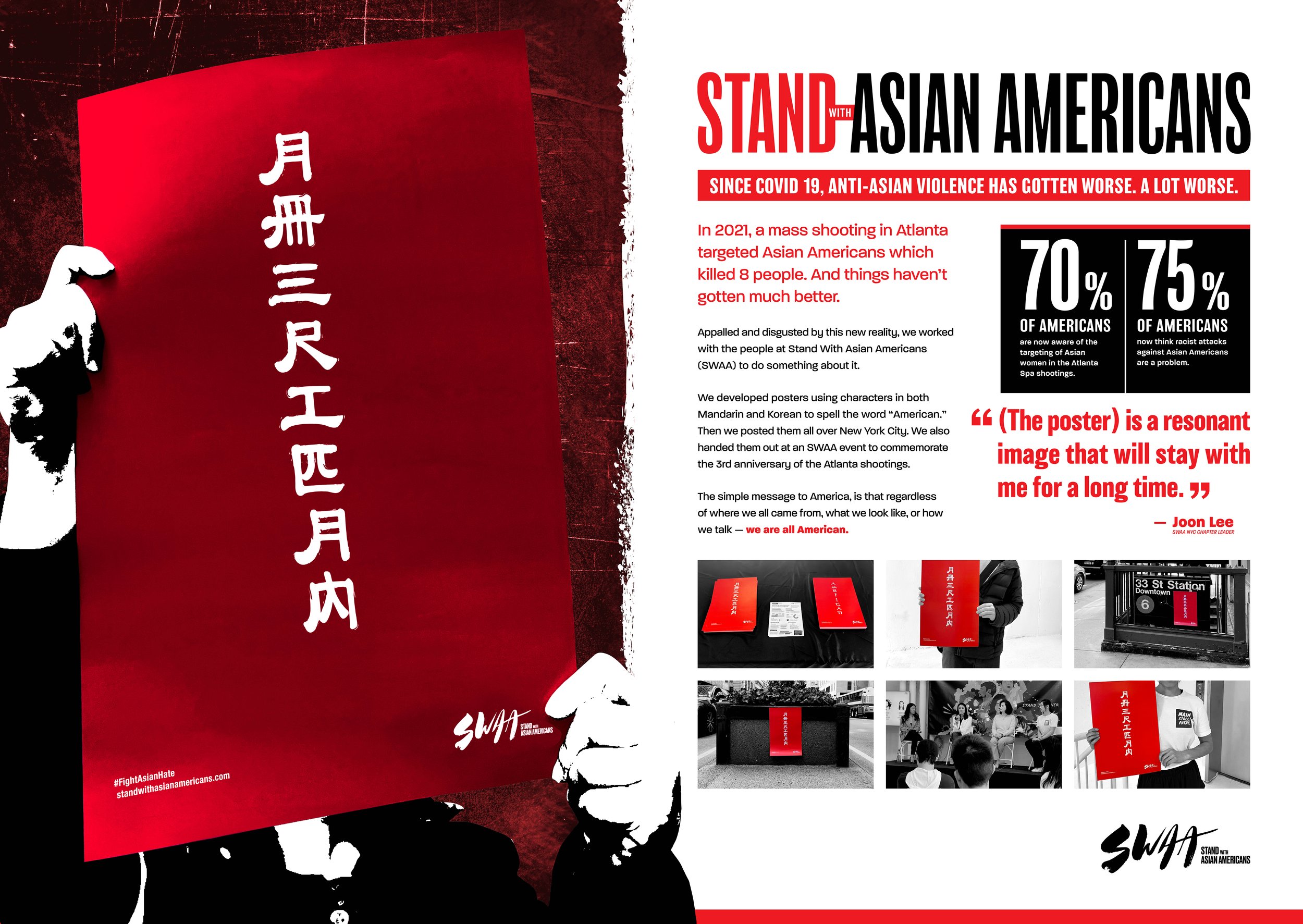
stj_logo_progression-05.png

Blog

Inspiration. Explanation. Thoughts

Travel Poster for Historic Geneva Museum

I had the opportunity to collaborate with the Historic Geneva Museum on a travel-poster of The Willows at Seneca Lake in New York. This fundraising effort highlights the nostalgic Willow tree line along the Seneca Lake. It was definitely a fun collaboration!

Diego Melendez
Green screens, VO actors and after effects

I got the exciting opportunity to create this promo spot for the company I work for. It was a fun project, from the storyboarding, to selecting the music, to the final product and also because I had the chance to collaborate with voice over actors. I was very pleased with it! I can’t to do more!

Diego Melendez
Creativity through movement

When I’m not designing, I’m still creating. Immersing yourself in music and rhythms from around the world is a way to expand your mind. As a Zumba instructor, I’m working my creative muscles to be able to not only remember the right moves, but also put together a playlist that my students will enjoy and make them feel successful. Not to mention dancing is great for the soul!

Diego Melendez
SJA Athletics: The fine lines of refining a logo that's already been created

I’m no stranger when it comes to refreshing visual identities. They’re one of my favorite projects to work on. I’m constantly asking “how can this go further and be more exciting and powerful.” Making adjustments to visual identities is necessary because sometimes what’s already been created is not consistent, lacks excitement and can limit what you can do for future assets. It’s important to asses, observe and understand what’s working and what’s not. With this in mind, I decided to enhance a logo that already existed.

The STJ logo evolved through the decades, but still remained with the three letters joined together to form a logotype. The latest logo available at the time had uneven edges and the overall proportions made it difficult to fit inside basic shapes like circles and squares and there was no consistent typography. While the logo looked ok at smaller scales, it posed many problems when enlarged.

The first part of the process involved adjusting and cleaning the edges so that the mark worked well at larger scales. This version was tested and used in apparel and other materials. Im my findings, I still found that proportions and symmetry remained a problem.

The school was about to renovate the basketball court and it needed a new court design. At this point it was necessary to create a version of the logo that would adapt to any environment, proportionally. It needed to work inside basic shapes.

During my research into the origins of the logo, I found that the closest font family to the mark was Copperplate. I adapted these letters to the joint style of the logo. I shortened the top and bottom of the J, to balance out the final design. The end product was well balanced and received.

After the logo was completed, I introduced font families that had the collegiate/athletic flair, that would work for collateral materials and environmental uses. Check out the completed work.

Diego Melendez