stj_logo_progression-05.png

Blog

Inspiration. Explanation. Thoughts

Featured in CURRENTS Magazine!

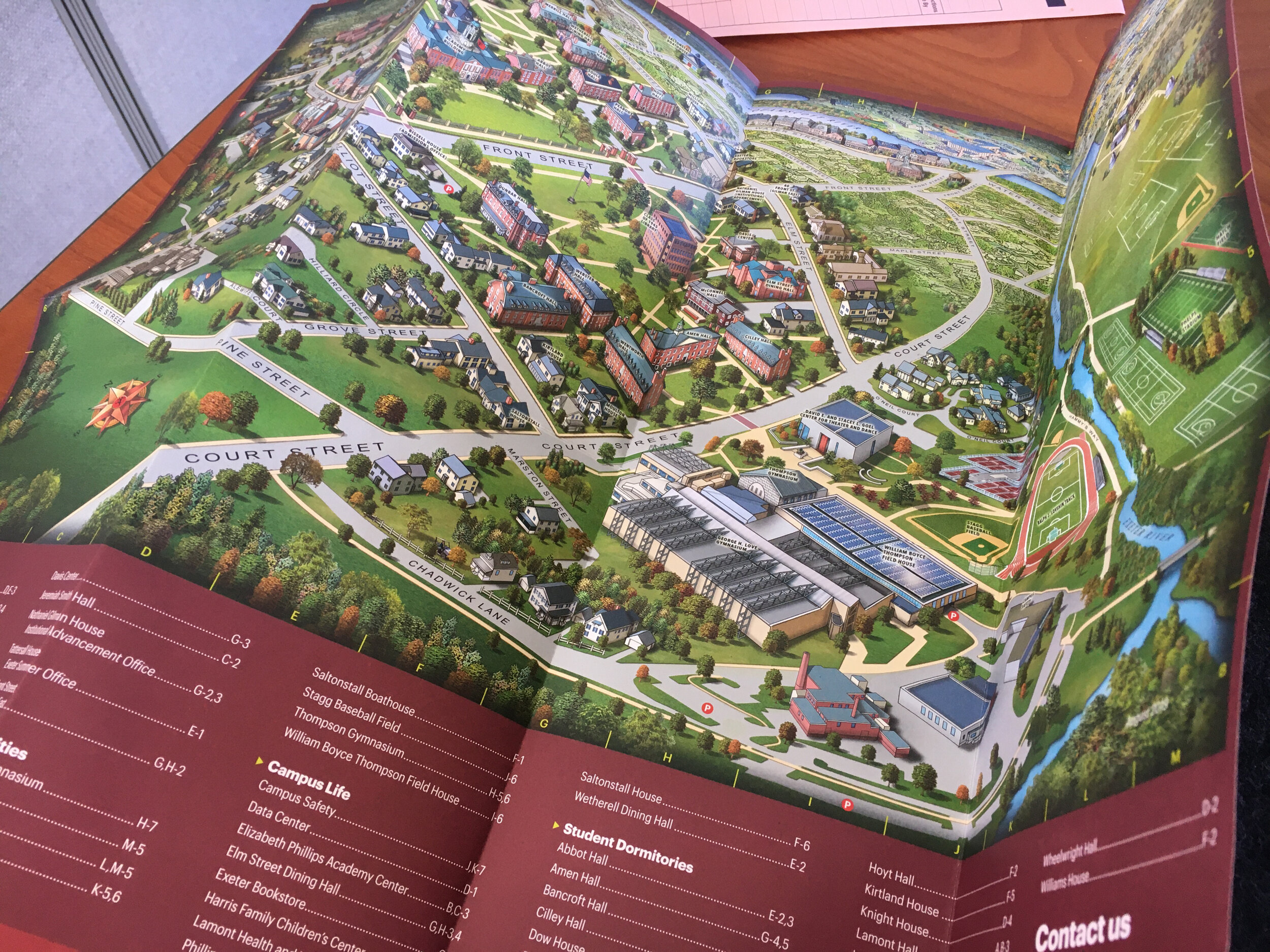
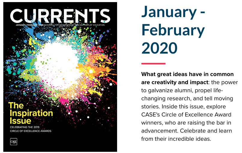
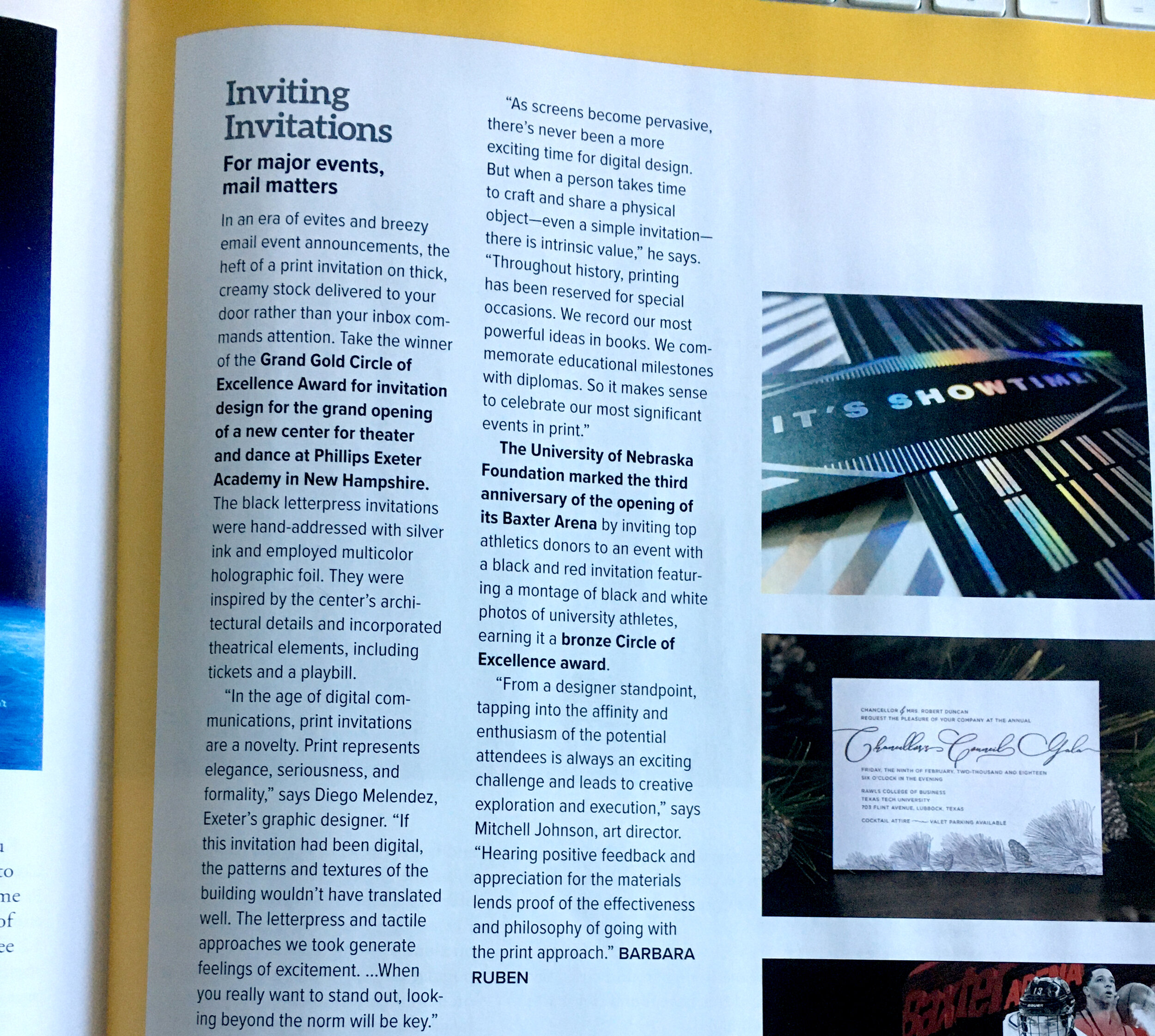
Currents Magazine is a publication put together by the Council for Advancement in Support of Education (CASE) and covers a variety of topics related to the advancement (fundraising, admissions, marketing, etc.) in higher-ed. Each year they host a highly competitive competition called the Circle of Excellence awards, and then a volume of CURRENTS is all about the winners and their thoughts. When I first saw one of these issues, I told myself that I would someday have my work in it. Fast-forward a few years later, and here it is! My invitation for the opening of the Goel Center made it in, and I had the opportunity to share some of my thoughts for the magazine. #motivated.

Diego Melendez
New email designs. Some UX Love

I was tasked with redesigning the email templates for different types of communications. The templates needed to be clean, simple, and easy to use. Using the platform, imodules, I was able to put together a suite of templates that could be used for: newsletters, general communications, special communications, and events. I rolled up my sleeves and dove right in, by sketching and mapping how the email should look. I wanted to create a simple user experience to make the information more digestible. I made recommendations on font sizes, colors, word counts, photo sizes, and understood how these templates would behave on mobile. They came out great!

Diego Melendez
Unsung Hero: Soft Touch paper finish
IMG_9822.JPG

In a world of digital communications, print is now a novelty, it won’t be going anywhere any time soon! There are so many different types of papers and finishes and choosing the right one is important for your piece to stand out.

I’m a huge fan of uncoated premium paper because they make your pieces feel more solid, whereas coated papers make them feel on the cheaper. BUT WAIT, THERE’S MORE!

There’s a different kind of paper finish that many people don’t know about. It’s called soft touch. This paper gives your pieces a unique feel, to the point that you’re trying to understand what kind of paper it is. It all starts with a coated (shiny) sheet of paper, and then a varnish is added to eliminate glossiness and give it the matte beauty of uncoated paper, giving you a sheet that makes your images stand out more, but won’t make your piece look or feel cheap.

Here’s a redesign of an admissions travel brochure which will set the pace for future printed materials. I feel that this soft touch finish will take off!

Diego Melendez
My first large map!

I had the opportunity to collaborate with the awesome map illustratorm Jean-Louis Rheault (http://jlrmaps.com/ ) on the creation of this campus map. It was a year-long project, but incorporating his illustration and applying our visual style gave us a great piece. We wanted to make it user-friendly and used a simple phrase “you are here” with a universal icon for location. Loved the final piece. It was printed by our friends at Puritan Press.

Diego Melendez