

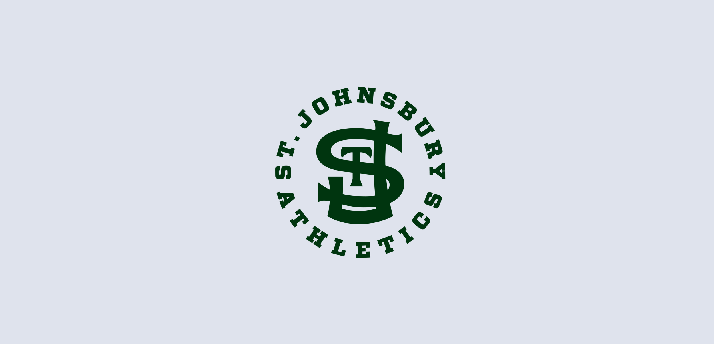
Primary Logo
Check out the design process.
Evolution
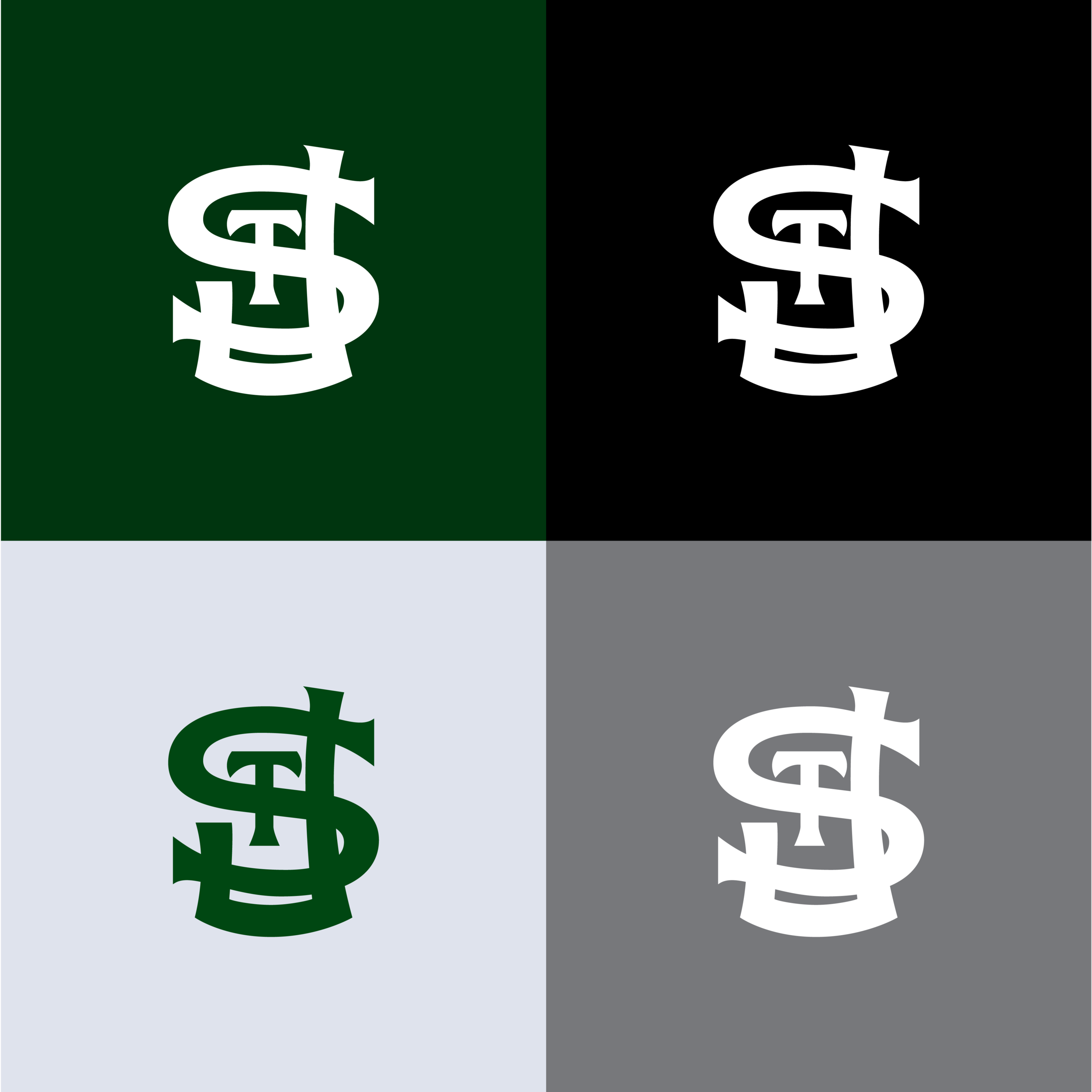
Secondary Logo

Tertiary Logo with Outline

Color Palette

Stationery for Athletic Department
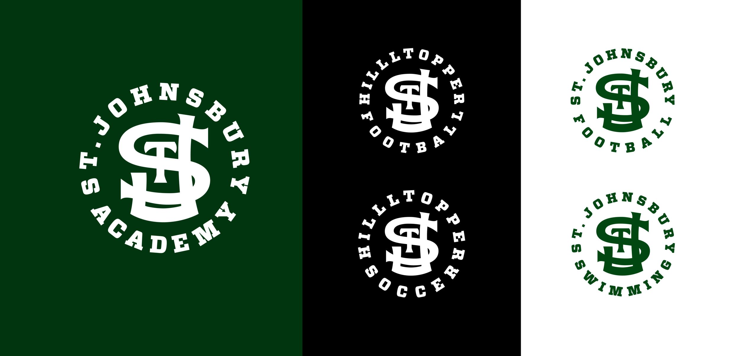
Alternate Naming

Typography

Base Typography Lockups
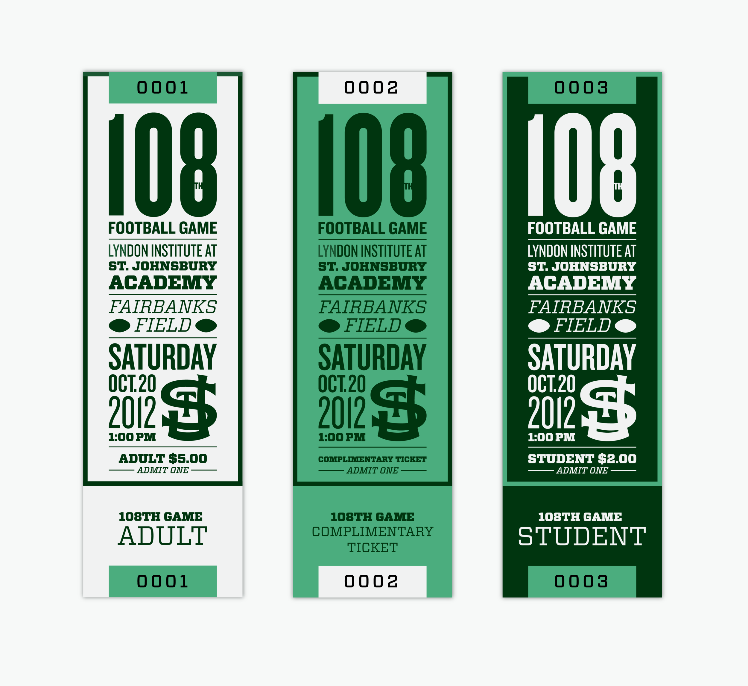
Game Ticket Design
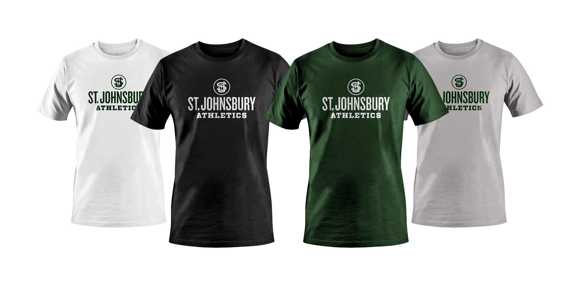
Base T-shirt Design for Coaches and Student Athletes
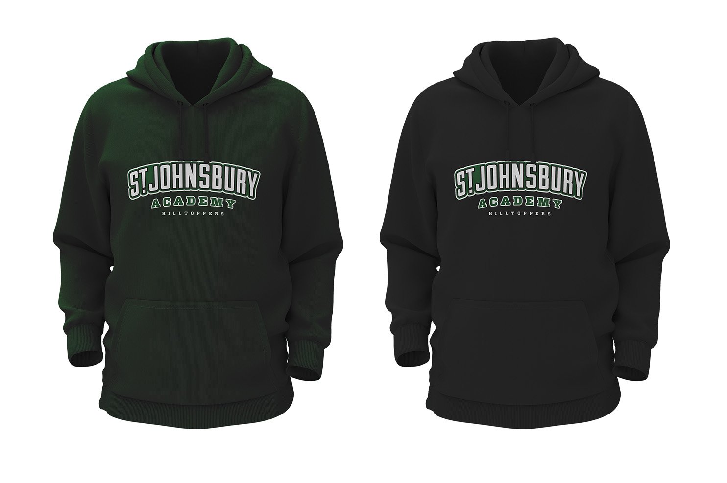
Alternate Hoodie Design

Water Bottle

Full Page Newspaper Ad

Hats
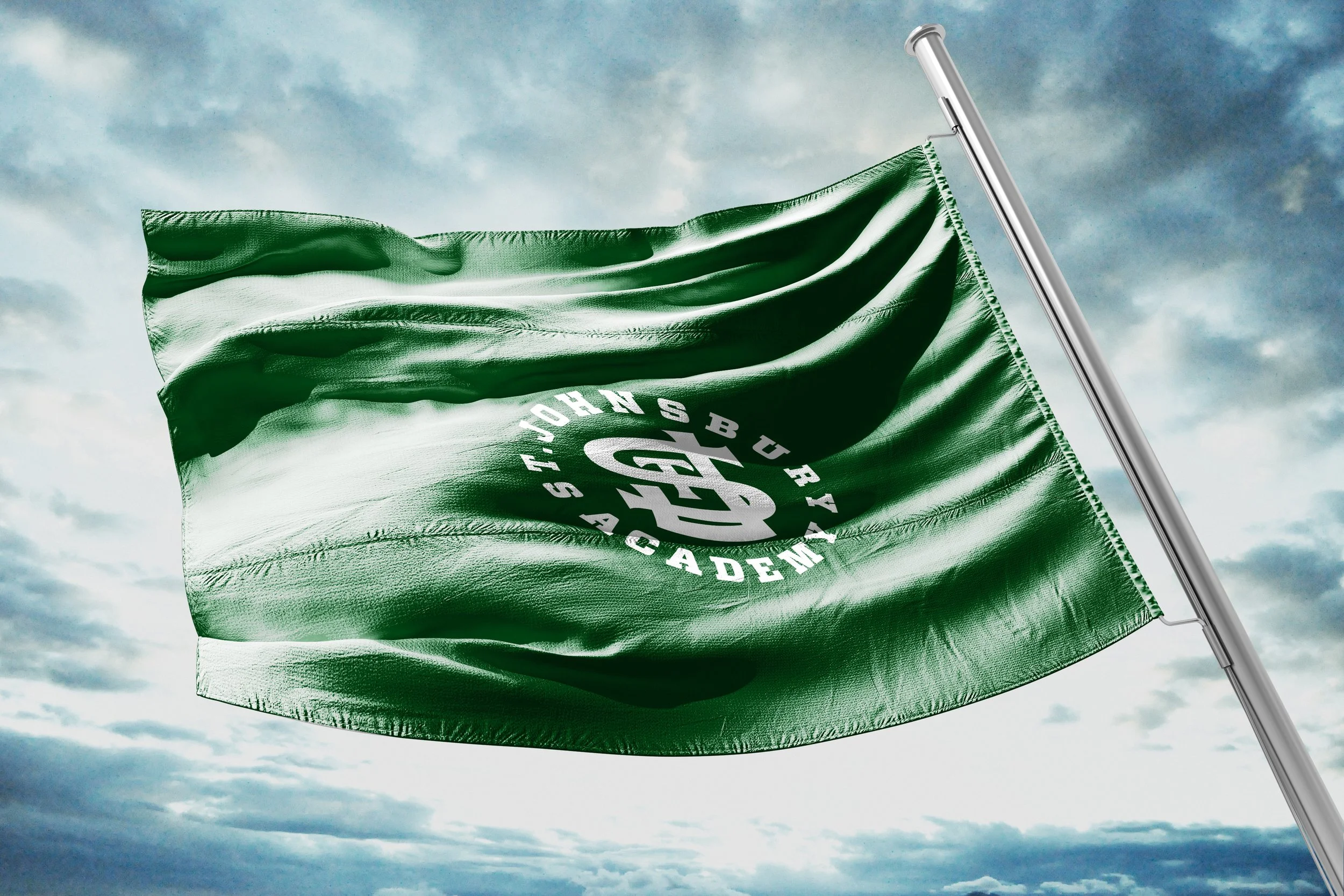
Flag

Gym Renovation: Basketball Court Design
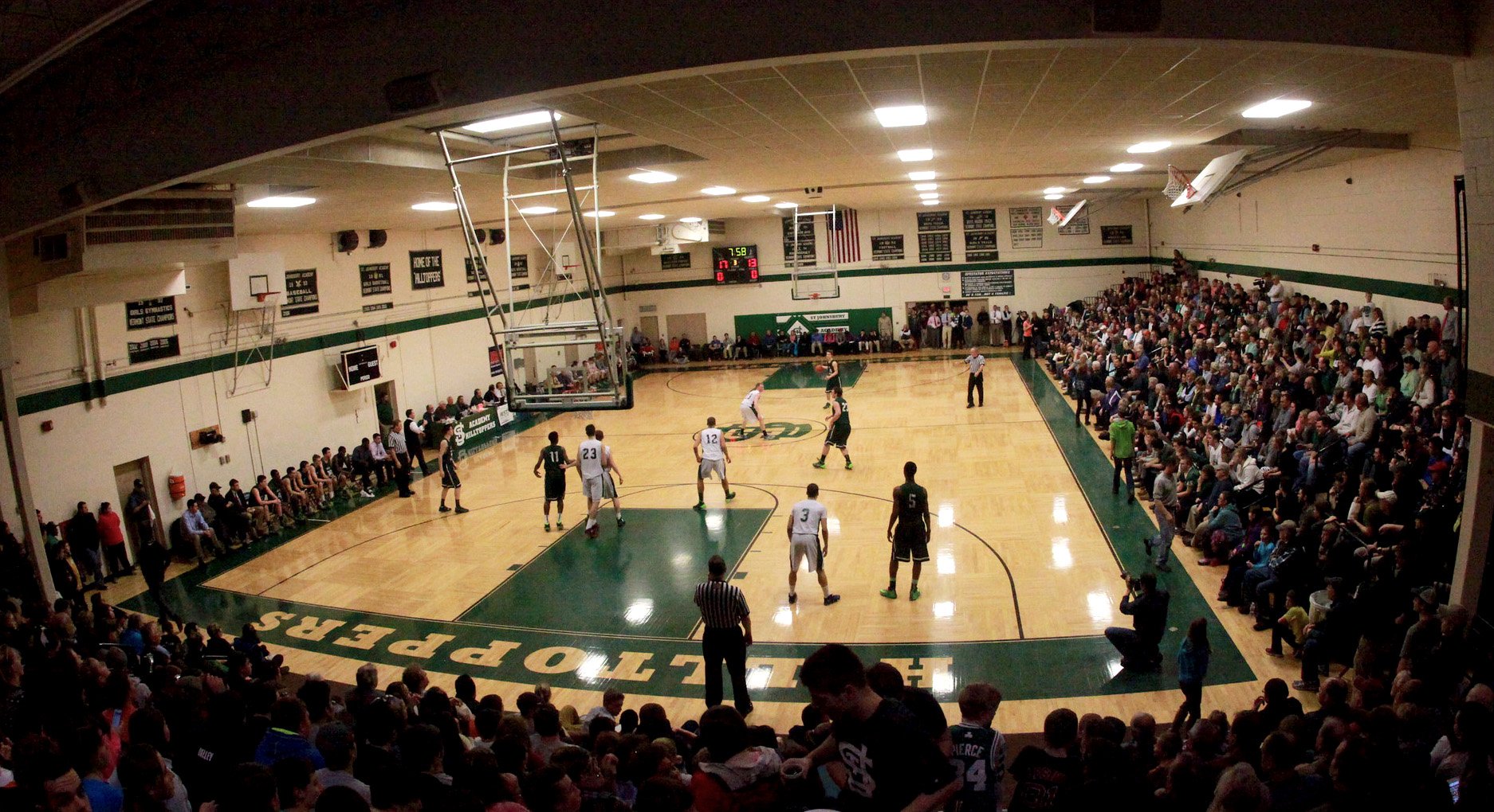
Completed Basketball Court
(Photo Courtesy of Michael Beniash)
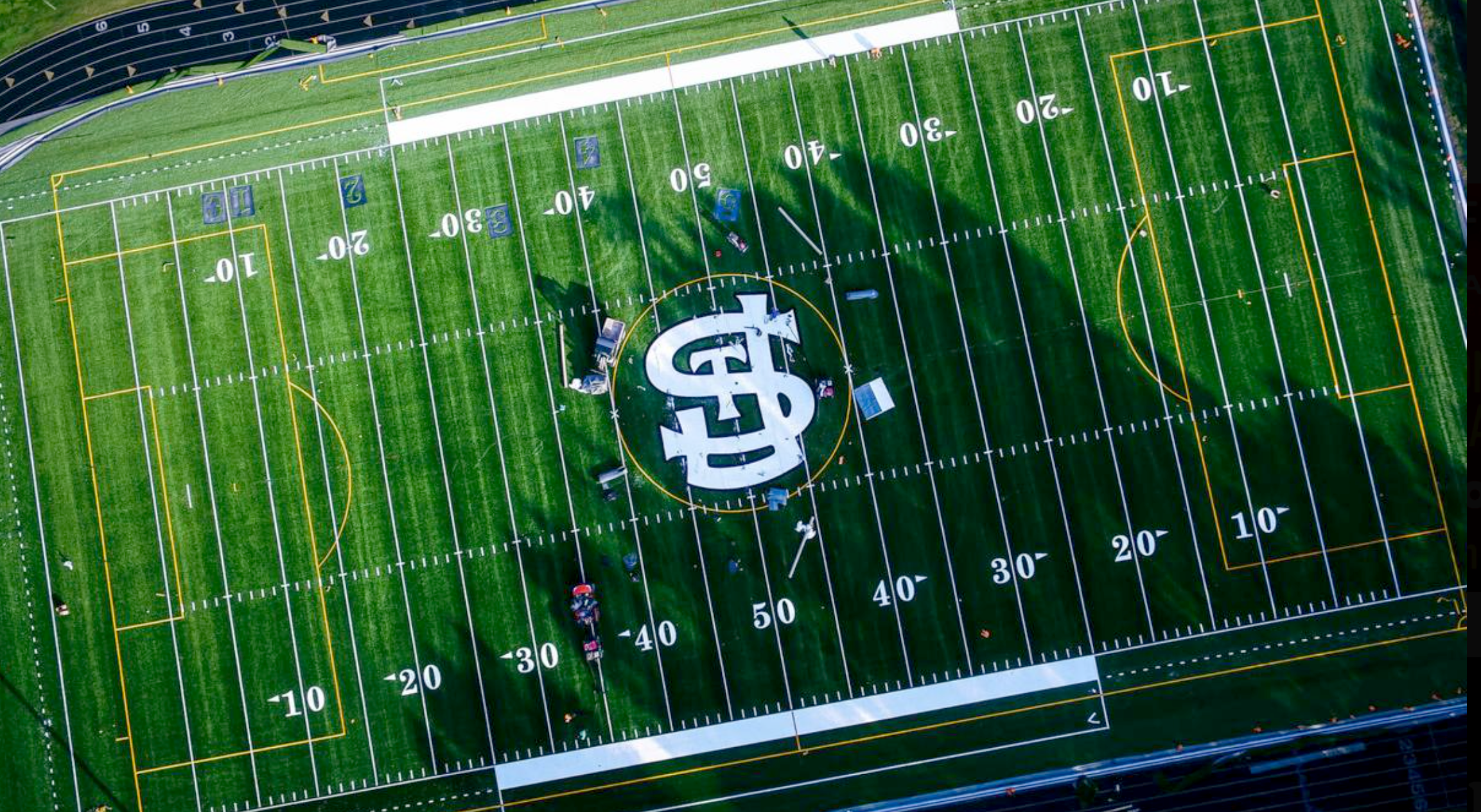
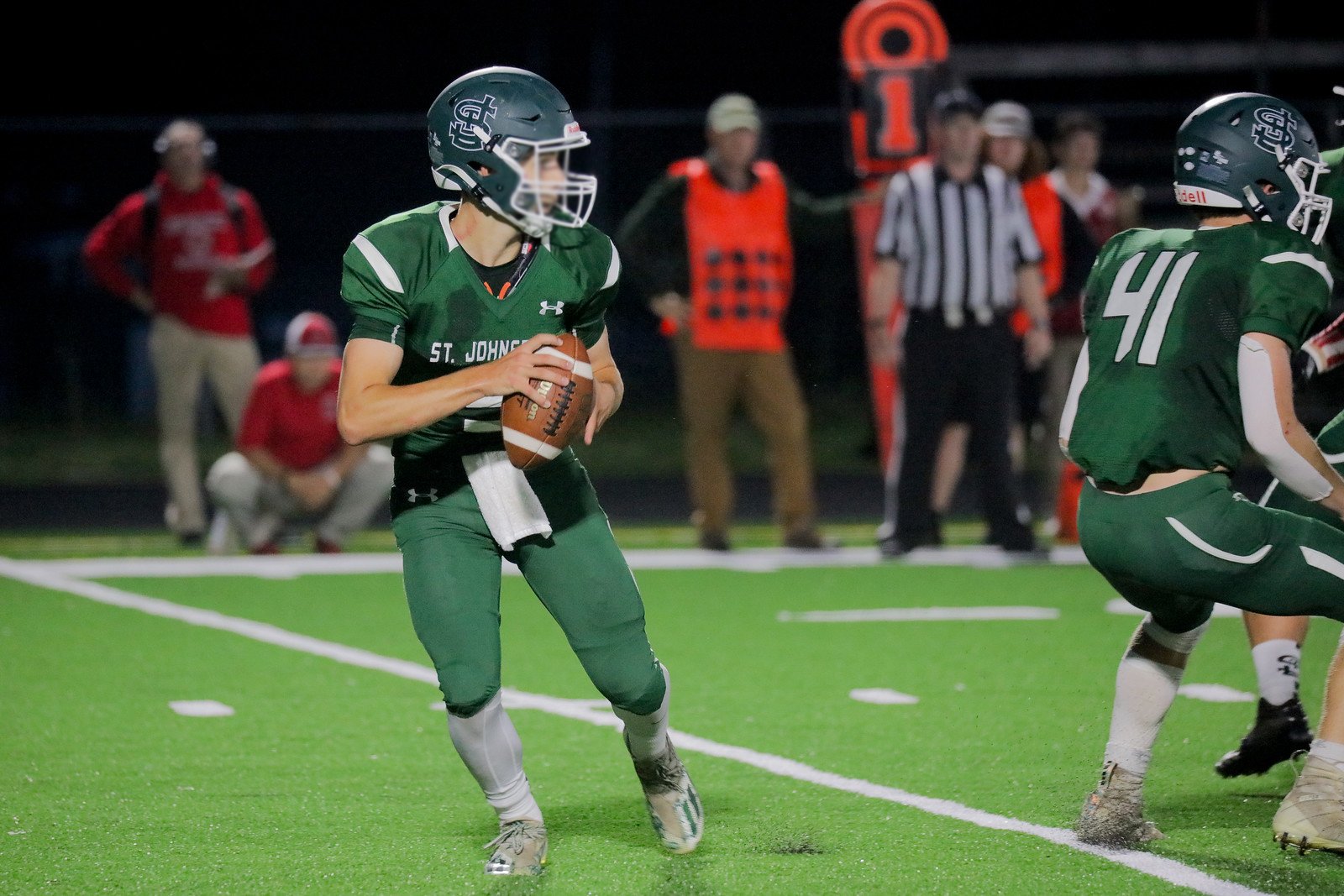
New Turf Field
(Photo Courtesy of Michael Beniash)
Custom Event Visuals

Social Graphics
Social Graphics

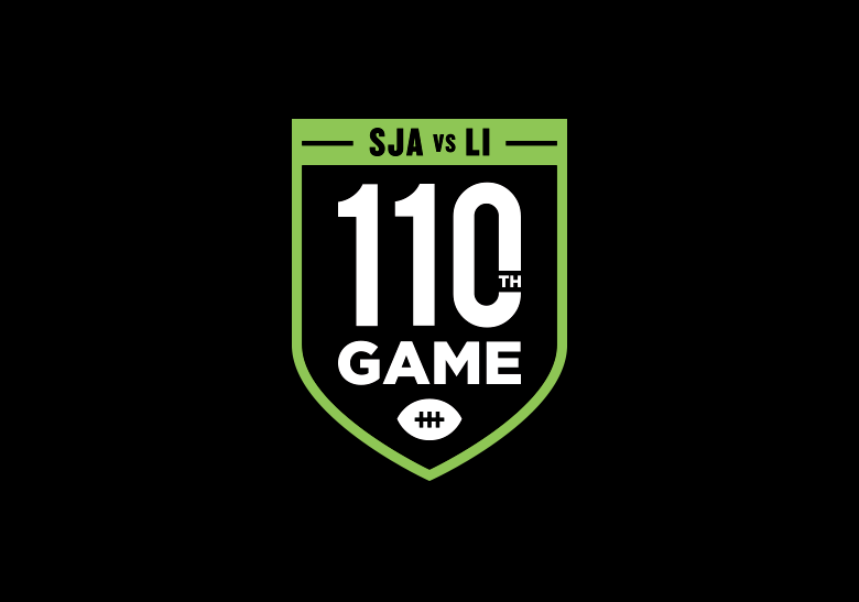
Custom Event Ticket Design
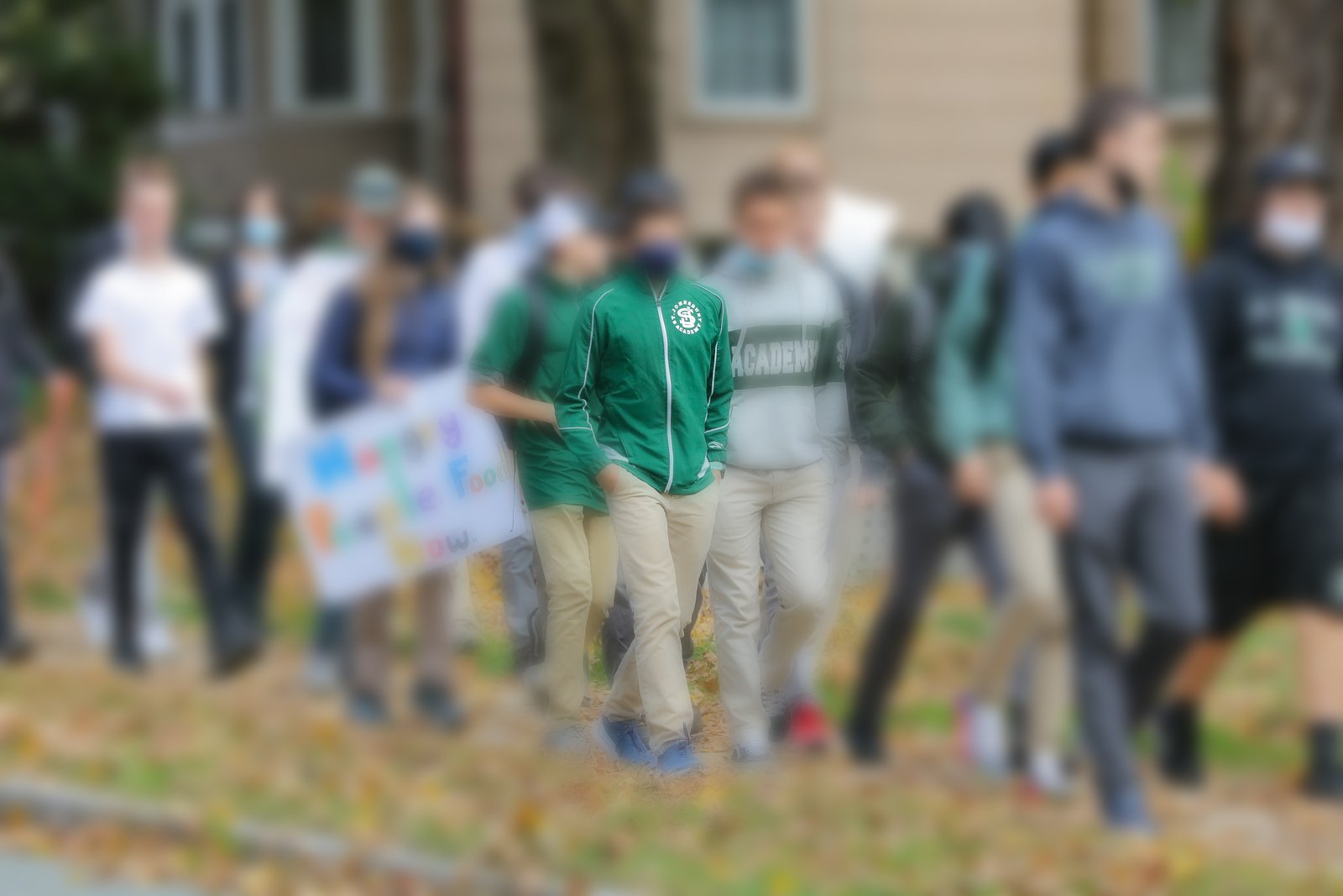
Logo in use